
You might be familiar with the supposed “Waitrose effect” where living near a Waitrose can add tens of thousands of pounds to the value of your house.
This doesn’t mean that a new Waitrose in your area will suddenly raise house prices through the roof. Waitroses will typically be built in areas where people can also afford to buy expensive houses.
So the presence of a Waitrose means it’s more likely that an area is expensive – but it doesn’t cause the area to become more expensive.
To write this article, I crunched through FindMyArea’s data on 4,231 supermarkets across London from 7 major chains to analyse a couple of things:
-
Are Waitroses really associated with higher house prices or is that a myth?
-
What about Aldis and Lidls – are they associated with cheaper areas?
-
What if there’s more than one supermarket in an area?
-
What else does the presence of a supermarket chain imply about an area? (Is a Waitrose more likely to show up in an area where there are particular types of restaurants or gym chains? Does a high crime rate mean a Lidl is likely to be nearby?)
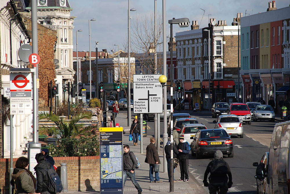
Let’s first look at two areas in London with local Waitroses. Pretty nice, huh?


And now here are two areas with local Lidls.

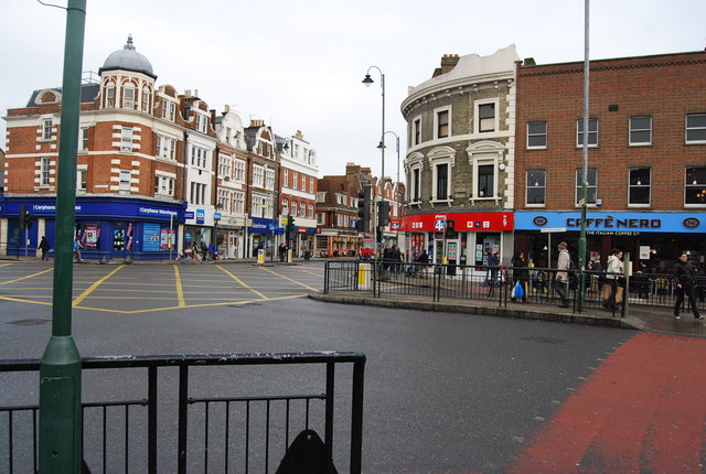
Depending on your preferences, you might find these areas to be more up your street than the Waitrose neighbourhoods. Or you might be recoiling in horror.
Now it’s time to look at the data.
1. Tescos and Sainsburys are everywhere in London
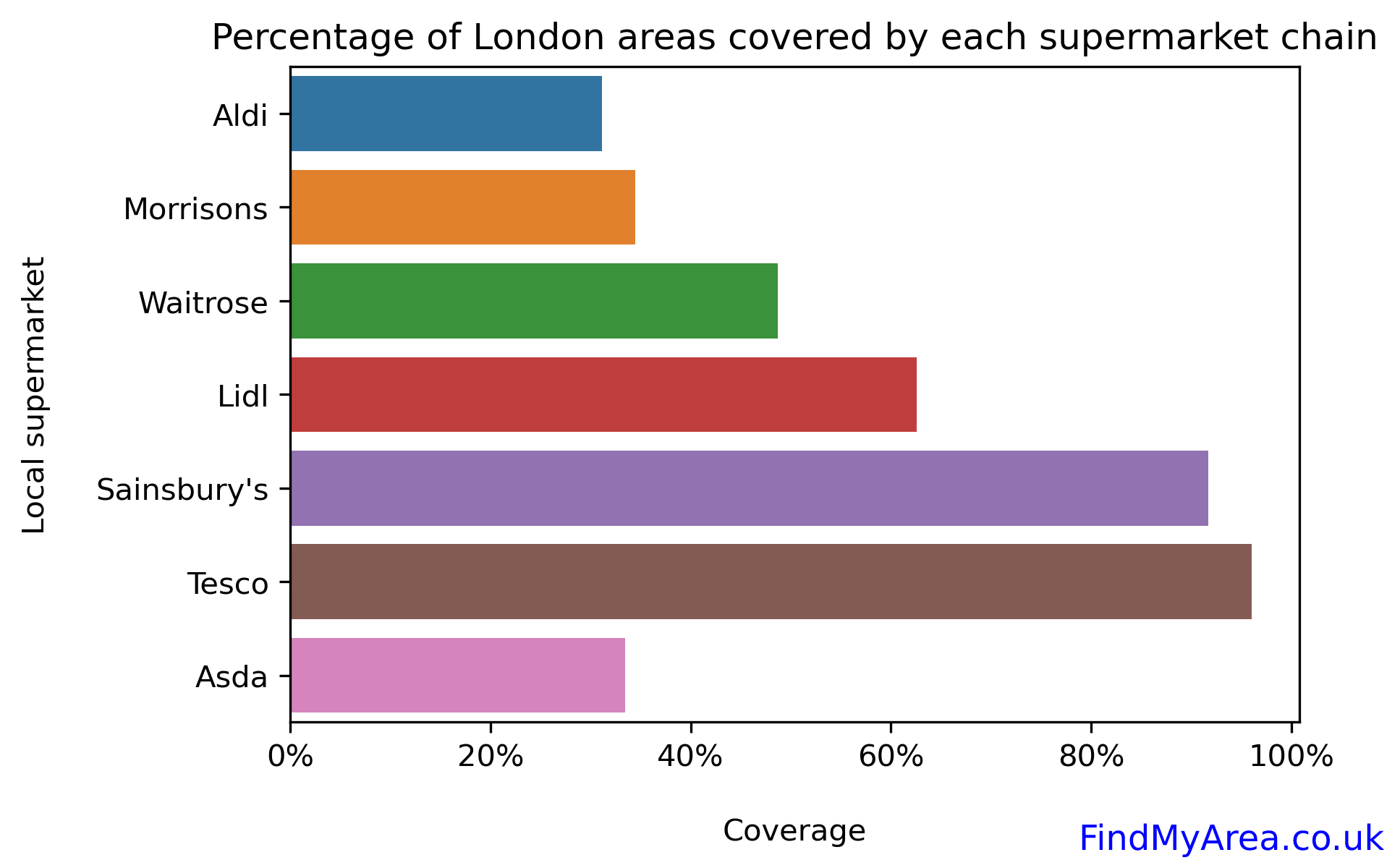
Of the 302 London areas covered in this analysis, 290 have a Tesco and 277 have a Sainsbury’s.
This is partly because these chains have numerous small stores scattered throughout the capital – you can’t walk very far without seeing a Tesco Express or Sainsbury’s Local.
Waitrose’s small-format stores don’t have quite the same level of coverage!
2. Flats in areas with Waitroses are 12% more expensive than those in the average London area
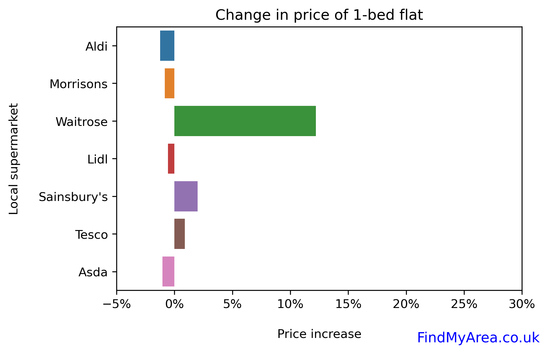
The big green bar shows that the Waitrose effect is not a myth! Interestingly, the presence or absence of any of the other supermarket brands is not associated with a large difference in the average house price, which leads us to the next factoid:
3. Aldis and Lidls are not associated with large drops in house prices
You can see in the graph that areas with “budget” supermarkets (Asda, Lidl, Aldi, Morrisons) are at most 1% less expensive than the average London area – not a huge amount overall.
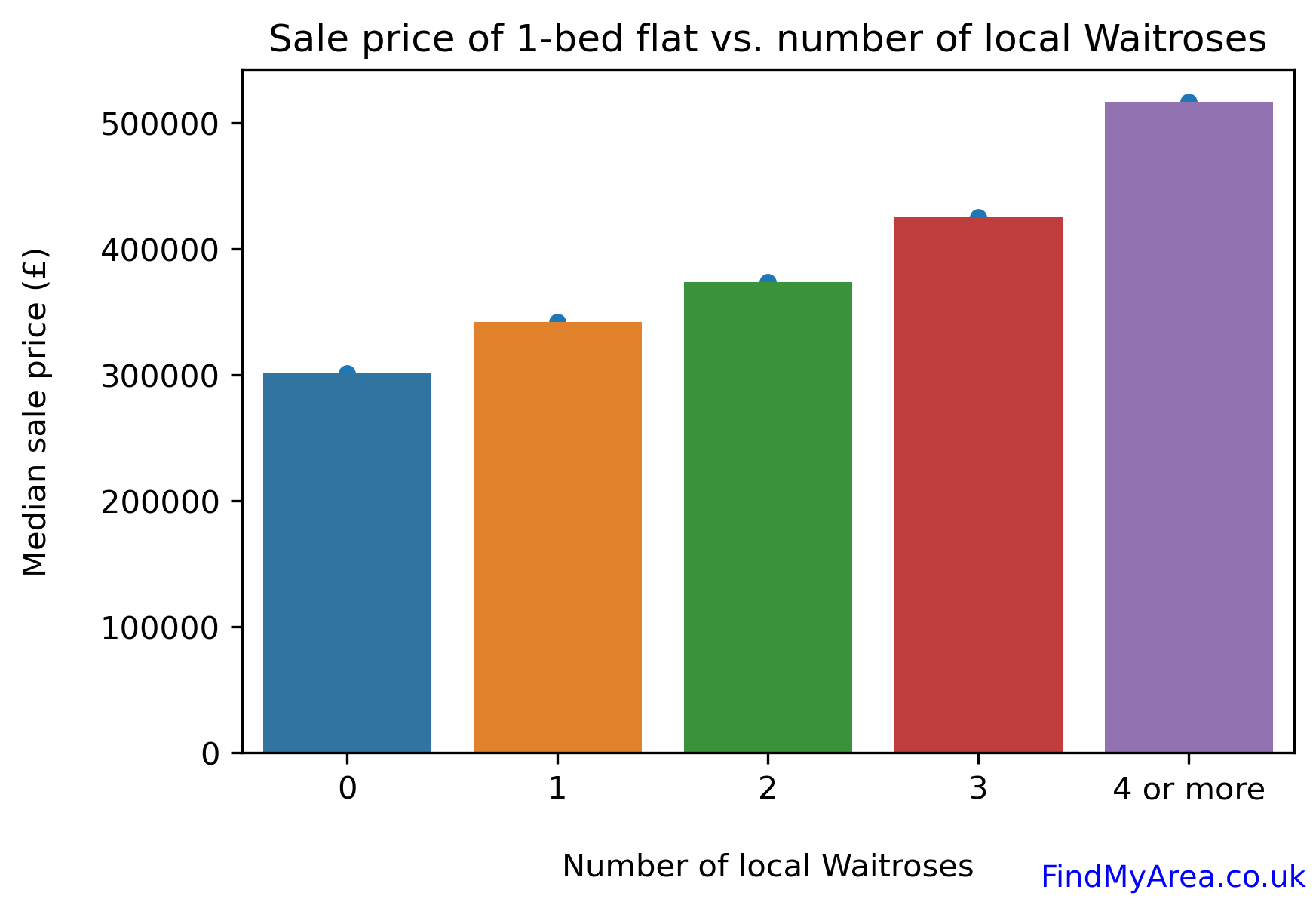
If an area with one Waitrose is expensive, does that mean an area with two Waitroses will be mega-expensive?
4. Each additional local Waitrose adds another £30-50k to the average price of a 1-bed flat
Each new Waitrose is associated with an increase of tens of thousands of pounds in the value of a house in the area, proving that rich people prefer short chauffeur rides to the supermarket. (Most of these will be small Waitroses of course.)
5. The more supermarkets the merrier
Actually, having lots of supermarkets is almost always good news for an area’s house prices – even if they’re not Waitroses:

This shouldn’t be too much of a surprise, because the number of supermarkets in an area is correlated with how close it is to central London. Having lots of supermarkets also indicates that there is plenty of demand in an area – it’s a sign of vibrancy and life!
Let’s now have a look at some exceptions to the “more the merrier” rule…
6. An Asda and a Morrisons is the “worst” possible combination for house prices
If an area has a Waitrose but also a Lidl, does the Lidl exert a sort of drag effect on the area – a bit like Brad Pitt hanging out with, well, me? What about multiple budget supermarkets?
The heatmap below tells us how areas with two supermarket chains are associated with increases/decreases in house prices.
A light colour for the grid square means that the two corresponding chains are associated with a gain in the house price. Conversely, a dark colour means the two chains are associated with a decrease in house prices.
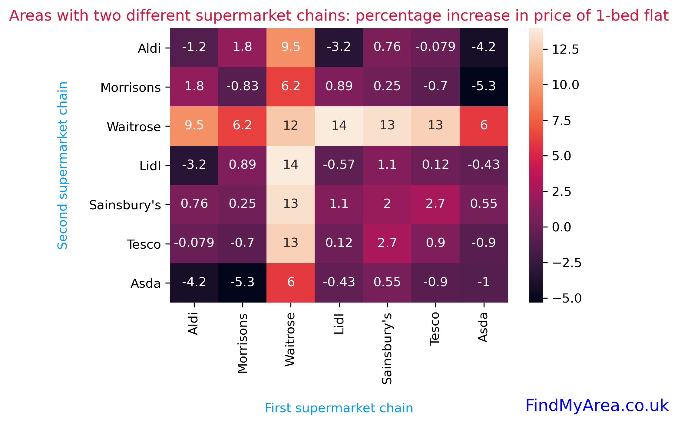
We can quickly see that the lightest colour for a square is for the combination of Waitrose and Lidl – the square tells us that areas with both a Waitrose and Lidl have house prices that are 14% higher than the average area. This is slightly counterintuitive given that Lidl is a budget chain!
At the other extreme, the pairing of Morrisons and Asda corresponds to a very dark square. Areas with these two supermarkets are 5.3% cheaper than average.
(What about grid squares on the diagonal? This just shows the percentage increase when an area has one supermarket chain – for example, an area with an Aldi is 1.2% cheaper than average.)
House prices aside, what else can we say about areas that contain Waitroses?
Being both lazy and a data scientist, I built a machine learning model to quickly tell me what other things are correlated with the presence of a Waitrose. Among other things, the model looked at local transport links, commute times, crime rates, pubs, bars, cinemas and green spaces to see which (if any) of these was highly correlated with the existence of a Waitrose.
These were the most interesting tidbits.
7. Areas with an Italian restaurant are 22 times more likely to have a Waitrose than those without any Italian restaurants
The graph below shows how the presence of various local amenities is associated with how likely it is that an area also contains a Waitrose.
The brown bars show the percentage of areas with a local Waitrose when the corresponding amenity is in the area. In contrast, the blue bars show the percentage of areas with a local Waitrose when the corresponding amenity isn’t in the area.
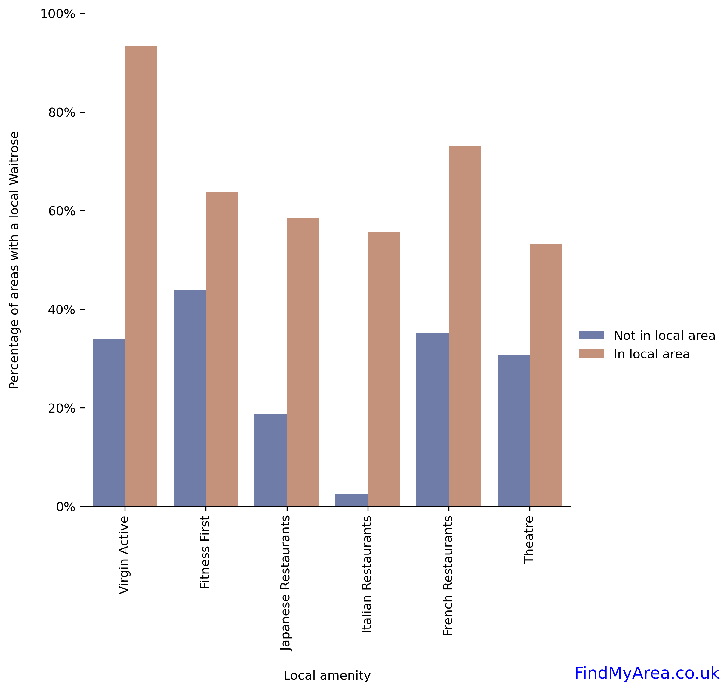
We can see that if an area doesn’t contain any Italian restaurants, it’s virtually certain that there also won’t be a Waitrose.
In fact, running the numbers shows that areas with at least one Italian restaurant are 22 times more likely to have a Waitrose than those areas with no Italian cuisine at all. Yum!
We can also read a couple of other things from the graph. For example…
8. Almost every area with a Virgin Active also has a Waitrose
Basically, if you can see a Virgin Active in the area, you’ll probably be able to find a Waitrose as well. I guess it makes sense to eat healthy organic food after spending time working out…
9. Areas with high crime rates are very likely to have Lidls

The grid of charts below deserves a bit of an explanation.
Let’s examine the graph for Aldi on the top left. The blue bar shows the fraction of areas with a very low serious crime rate that contain an Aldi; you can see that it’s slightly lower than 25%. Similarly, the red bar shows that about 30% of areas with a high serious crime rate contain an Aldi.
Looking at the whole grid of supermarket charts, what we’re searching for is some kind of positive or negative trend. You can quickly see that Lidl and Asda clearly stand out and do show a trend.

An area with a high serious crime rate is roughly twice as likely to have a Lidl than one with a very low serious crime rate – in fact, 79% of areas with a high serious crime rate also have Lidls. And only 6% of areas with very low rates of serious crime have an Asda.
Caveats for nerds
This article is mostly just for fun and certainly isn’t meant be a super-rigorous piece of statistical analysis.
But it’s still worth pointing out a couple of limitations:
- Correlation is not causation! Building tons of supermarkets isn’t likely to directly result in an increase in house prices. That said, the underlying reasons for those supermarkets being built in the first place might well be a sign of higher house prices to come – but figuring out a useful set of leading indicators is a much more difficult piece of analysis!
- All the house prices here are for 1-bedroom flats, with the prices averaged over each area. You generally see the same effects for 2- and 3-bedroom flats, however.
- Areas under consideration exclude Zone 1, as central London is generally a bit weird and has ludicrous numbers of supermarkets of every type.
- What’s defined to be “in” an area is quite generous – read this for more details on how it works.
- Any given supermarket can “belong” to multiple areas.
- There’s no distinction in this analysis between small and large stores (e.g. a Tesco Express vs. a Tesco Superstore).
Thanks for reading
One of the nice things about working on FindMyArea is that it gives me access to loads of interesting data on every area in London. In future articles I’ll look into the following:
- COVID vaccination rates: what kinds of areas have high/low rates?
- Political affiliation and house prices: are areas with Conservative MPs more expensive?
- London’s most “valuable” tube lines
- London’s most “valuable” cuisines (see a theme here?)
- Air pollution across the city
- Broadband provision and remote working across London
- Head-to-head comparisons between areas
Let me know if there’s anything specific you’d like me to look into!